Most indie author websites are useless. Pretty, but useless.
The author had a designer build a beautiful five-color site with hero images, animated transitions, and a clever logo. The site loads. Visitors land. And then nothing — no email signups, no book buys, no continued browsing. The site is a digital business card that doesn't convert.
This is the most common pattern in self-publishing because author website advice has been bad for a decade. Most guides tell you to "showcase your personality" and "share your journey" — neither of which is the job of a sales page. A book buyer landing on your site has one of three intents: figure out if your book is for them, buy a book, or join your list to hear about the next one. Your site needs to handle all three in 30 seconds or less.
This article is the five pages that handle those intents — with the structure, copy patterns, and conversion logic that actually works in 2026.
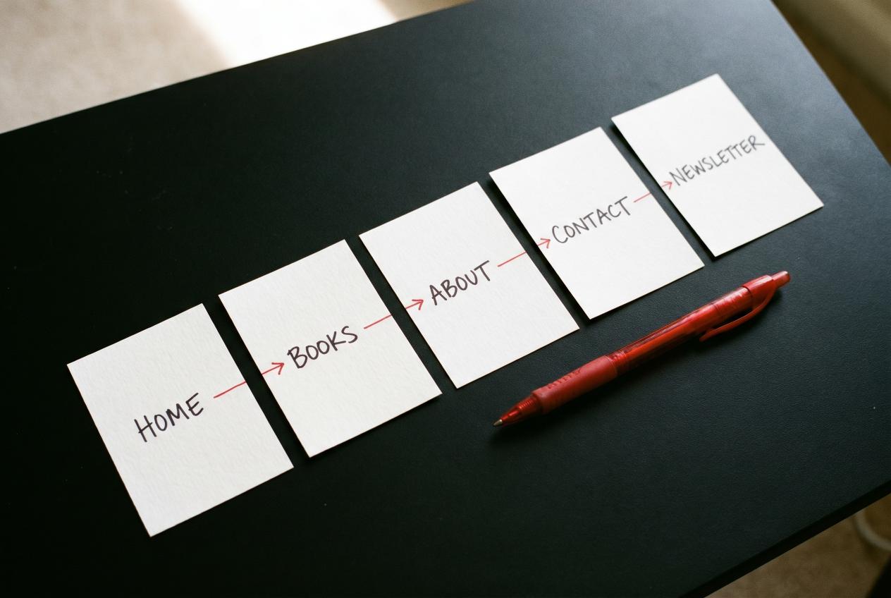
The Five Pages (Total)
Most authors think they need 8–15 pages. They don't. Five is the floor; five is also the ceiling for most authors.
| Page | Purpose | Time on page (avg) |
|---|---|---|
| Home | Hook + book pitch + email opt-in | 30–60 sec |
| Books | Buy links for every book | 60–120 sec |
| About | Trust + author photo + brief bio | 30–60 sec |
| Contact | Speaking, press, business inquiries | 15–30 sec |
| Newsletter (or "Free Read") | Lead magnet for email signups | 30–60 sec |
That's it. Anything more and you're spreading attention across pages that don't compound. Anything less and you're missing functions.
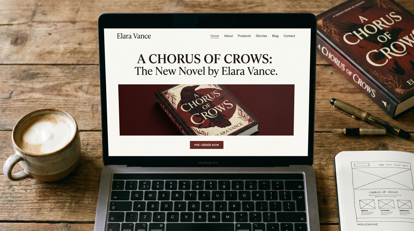
Page 1: Home — The 30-Second Sales Page
The home page does three things, in order:
1. Above the fold: book hook
Visitor lands on your site. In the first 800px (one screen), they need to see:
- Hook headline — not your author name (your author name is unknown; your book hook is the value)
- Subhead — the genre and the emotional promise
- Cover image of your latest/best book
- Single CTA button — "Read [Book Name]" or "Buy on Amazon"
What NOT to do above the fold: a slow-loading hero image with your portrait, a rotating carousel of book covers, a generic "Welcome to my author site" headline, or a video that plays automatically.
The 30-second visitor needs to know in 5 seconds: what kind of book is this, and is it for them?
2. Mid-fold: Other books + email opt-in
Below the hero, two blocks side by side (or stacked on mobile):
Other books block: a clean grid of your other titles with covers and "View" buttons. Visitors who didn't bite on the lead book might be sold by an older title.
Newsletter opt-in: "Get a free [genre-fit short story / chapter / novella] when you sign up for the newsletter." Lead magnet should be specific to your genre — a free romance novella for romance authors, a free thriller short for thriller authors, a free non-fiction PDF for non-fiction authors. Generic "join my list for updates" gets near-zero signups.
3. Bottom: social proof + footer
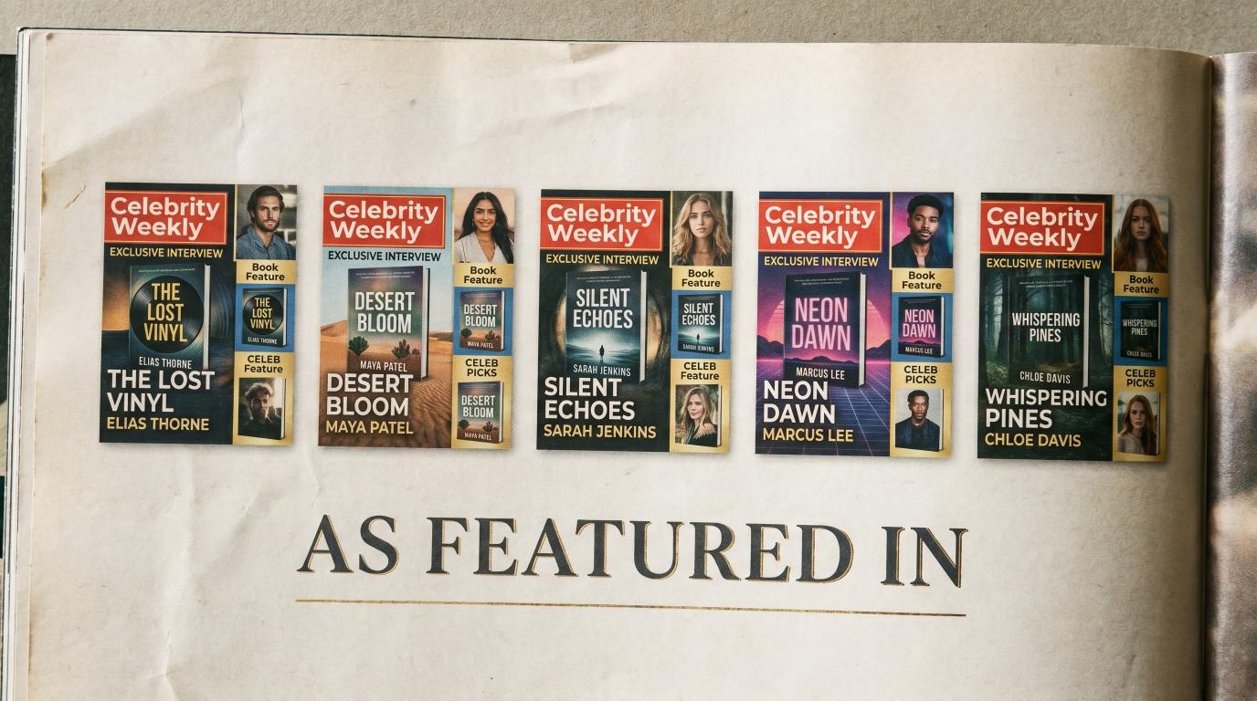
- 2–3 review quotes (real ones, with magazine/source attribution if you've gotten press)
- Logos of any places you've been featured ("As seen in: Closer Weekly, In Touch Weekly, Hollywood Life")
- Footer with: copyright, Privacy/Terms links, social icons (small)
If you've gotten editorial features in real magazines — through VUGA or otherwise — those magazine logos belong on the home page. They're the strongest trust signal an indie author can put on a site.
Page 2: Books — The Conversion Page
Most authors mess up the Books page in one of two ways: list every book chronologically (boring, hard to navigate) or hide the buy links behind paragraph descriptions (visitors don't want to read 400 words to find the Amazon button).
The right structure:
For each book:
- Cover image — large, prominent, on the left (or top on mobile)
- Title and series info — clean typography
- One-paragraph hook — 50–80 words MAX. The same hook from your Amazon blurb's first paragraph.
- Buy buttons — Amazon (always first), then any other retailers in a row of small buttons (B&N, Apple Books, Kobo, Google Books)
- "Read more" link — to the dedicated book page if you have one (optional)
Don't list every retailer your book is available on. Pick the top 3–5; the rest add visual noise without driving sales. According to BookFunnel's analysis, 80–85% of indie author retail comes from Amazon — your Amazon button should be the primary CTA, every other retailer should be secondary.
What about pre-orders?
Books in pre-order should be at the top of the books page with a clear "Coming [Date]" badge. Pre-orders count toward Amazon launch-day rankings, so giving them prime placement is high-leverage.
What about Goodreads?
Add a small "Add to Goodreads" button under each book. It's free social proof and helps your Goodreads "Want to Read" counts grow.
Page 3: About — Trust, Briefly
The About page is the page authors dramatically over-write. The visitor isn't reading a memoir — they're answering one question: "Is this author legit?"
The structure that works:
Top of page:
- Author photo (real, professional, takes 60% of the viewport on the hero block)
- One-sentence introduction: "[Your name] writes [genre] from [vague location, e.g., 'somewhere on the coast of Maine']."
Body (3 short paragraphs max):
- Para 1: Your credentials or background that's relevant to the books. ("I spent 15 years as a defense attorney before turning to write legal thrillers.")
- Para 2: Why you write what you write. (One concrete story, not "I've always loved books.")
- Para 3: Your books in one sentence. ("My current series follows [character] through [conflict].")
Bottom:
- Newsletter signup (different copy from home page — "Get behind-the-scenes notes plus a free [lead magnet]")
- Press inquiries: "[Email]"
- Social icons
What NOT to put on the About page: your full resume, your political opinions, an essay about your writing process, photos of your pets (unless you're a pet-genre author), childhood stories, or anything longer than 400 words total.
The whole page should be readable in 60 seconds.
Page 4: Contact — Functional, Not Decorative
The Contact page exists for three audiences:
- Press inquiries (journalists, magazines, podcasters)
- Speaking inquiries (bookstores, conferences, library systems)
- Business (foreign rights, audio rights, book club bulk orders)
It should not be a "let's chat!" generic contact form. It should triage the visitor's intent and direct them to the right path.
Structure:
Contact

For press inquiries: press@[yourdomain].com
For speaking and events: speaking@[yourdomain].com
For business and rights: business@[yourdomain].com
For everything else: hello@[yourdomain].com

[Contact form below]
If you don't want multiple email addresses, route everything to one inbox but keep the labeled signposts. The labels signal that you're a real operating author with proper boundaries — readers respect that.
The contact form should have:
- Name, email, subject, message
- A "What is this regarding?" dropdown (Press, Speaking, Reader Question, Other)
- That's it. No phone, no company name, no captcha that pisses off legit emails.
Page 5: Newsletter / Free Read
This is the conversion page that authors most often skip — and it's the highest-leverage page on the entire site.
The page does one thing: give visitors a free thing in exchange for their email address.
Structure:
Top (above the fold):
- Visual of the lead magnet (book cover for a free novella, a clean PDF cover for a free guide, etc.)
- Big headline: "Get [Free Thing]"
- Subhead: what they're getting (one specific sentence: "A free 30-page novella set in the world of [your series]")
- Email signup form — first name + email, single button "Send It"
Below the fold:
- 3-bullet list of what's in the free thing
- A 3-line preview from the lead magnet itself (so visitors can hear your voice before signing up)
- Privacy line: "I'll never spam you. Unsubscribe any time."
What NOT to do: put the signup form behind a "click here to learn more" multi-step flow. The email goes in the first form they see, or they leave.
What lead magnets actually convert
- Romance / Romantasy: a free novella set in the same world as your main series — high conversion (10–20% of visitors)
- Thriller / Mystery: the first 3–5 chapters of book 1 in a series, formatted as a clean PDF — medium conversion (8–15%)
- Non-fiction / Self-help: a worksheet, checklist, or 7-day mini-course delivered via email sequence — high conversion (15–25%)
- Memoir / Literary: rare to need a lead magnet; this audience comes via word-of-mouth more than newsletter
What does NOT convert: "subscribe for updates," "join my newsletter for behind-the-scenes content," or anything generic. Specificity converts.
What's NOT on the Site (Just as Important)
Things authors put on websites that don't help and often hurt:
- Blog with sporadic posts — empty or stale blogs hurt trust. Either commit to weekly posts or remove the blog entirely.
- Multi-language switcher if you only have one or two translations — most visitors won't use it; it adds visual noise.
- Social media feeds embedded on every page — they slow load times and pull attention away from your CTAs.
- "Process" or "Inspiration" pages — readers don't care; this is for you.
- Long bio with extensive credentials for fiction authors — fiction readers care about the books, not the resume.
- News page that's not updated — every "last updated 2 years ago" date kills credibility.
SEO Layer
Your author website needs:
- HTTPS (free via Let's Encrypt or hosting providers)
- Mobile responsive (60%+ of book traffic is mobile)
- Fast load times (< 3 sec; static sites or modern WordPress themes work; old WordPress sites with 30 plugins do not)
- Schema.org Author + Book markup on relevant pages — improves Google's display
- Open Graph tags so links shared on Facebook/Threads/X show your book covers properly
- Submitted to Google Search Console with sitemap
- Robots.txt allowing all relevant crawlers
For author keywords specifically (your name + book title combinations), the SEO is mostly automatic if your structure is right. You don't need to fight for "author marketing" or "self-publishing tips" keywords from your author site — that's what your publisher's site (or a dedicated marketing blog) is for.
The Press Logos Section — Your Highest-Trust Asset
If you've gotten editorial features in real magazines — Closer Weekly, In Touch Weekly, Star Magazine, OK! Magazine, Hollywood Life, TIME, Rolling Stone UK — those magazine logos belong on your home page in a "Featured In" strip.
This is the single highest-trust signal an indie author can put on a website. A reader who sees "as featured in TIME" or "as seen in Closer Weekly" makes a different decision than a reader who sees a self-published author with no validation.
Most indie authors don't have that strip because they haven't gotten the press. The traditional path (publicist for $20K+) made it cost-prohibitive. The contractual placement model has changed that math: VUGA Bestseller package at $7,997 delivers three guaranteed major-magazine features (Closer + In Touch + Star) — three logos for the strip, three permanent URLs to link to.
Add Authority package at $14,997 for OK! and Hollywood Life. Stack TIME and Rolling Stone UK add-ons for premium-tier logos.
If your author site is structured right but missing the press strip, that's the single highest-leverage upgrade you can make. The structure compounds with the trust signals.
Bottom Line
Five pages. Home that converts in 30 seconds. Books page with clean buy buttons. About page that's brief and credible. Functional Contact page. Newsletter page with a real lead magnet. Press logos on the home page if you have them.
That's the entire author website. Everything else is filler that dilutes the conversion path.
If your site has 12 pages and visitors don't convert, the problem isn't that you need more content — it's that you need to delete 7 pages and tighten the 5 that matter.
See VUGA author packages — Trial $97, Spark $997, Bestseller $7,997, Authority $14,997. Press features that turn into the "as featured in" strip on your author website.
Sources for this article:
- Reedsy, "10 Best Author Website Examples for Inspiration"
- Jane Friedman, "The Essential Guide to Author Websites"
- Kindlepreneur, "How to Build an Author Website"
- Joanna Penn, "Author Website Tips"
- BookFunnel, Author Documentation
Image generation prompts (Gemini Nano Banana Pro)
Hero image (1600×900, JPG):
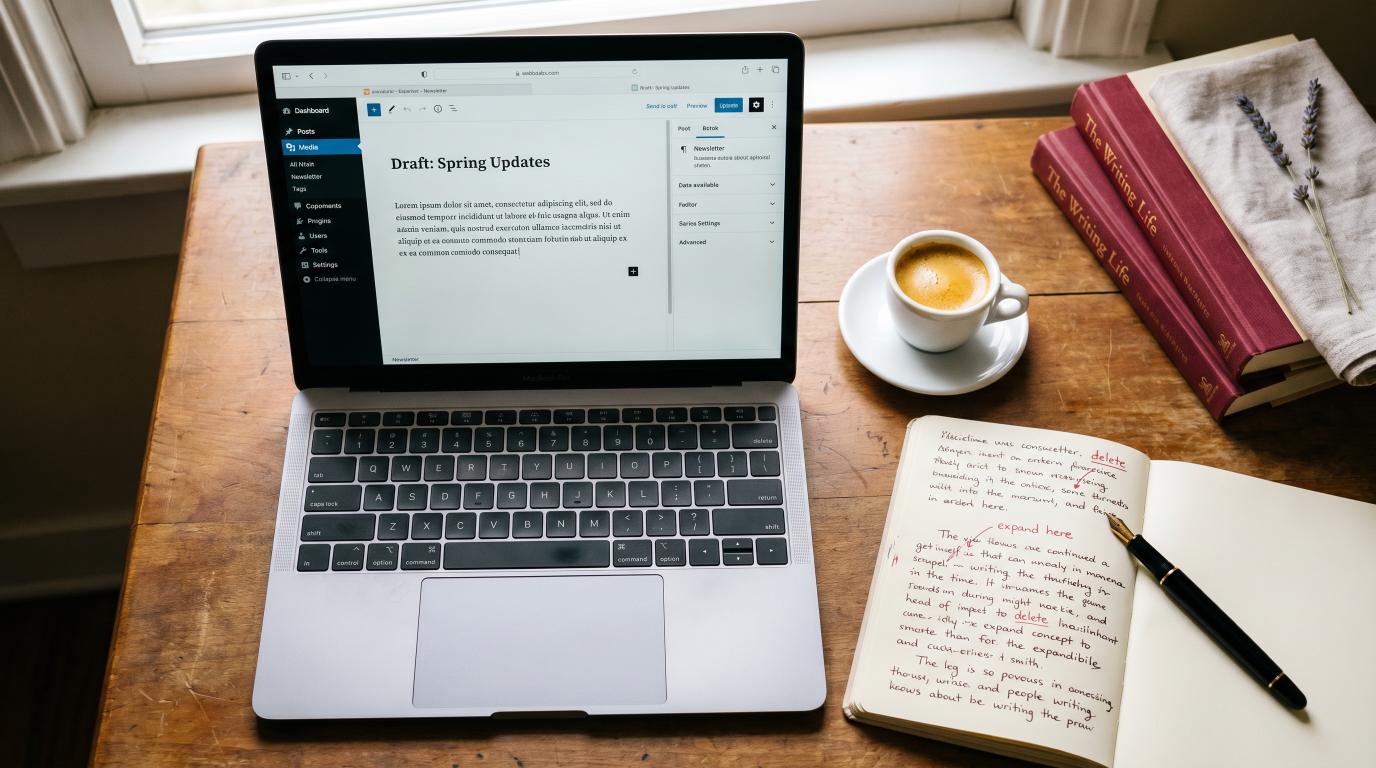
An overhead photograph of a laptop screen showing a clean, well-designed author website homepage — bold serif headline, hero book cover, clear CTA button. Surrounding the laptop on a wooden desk: a coffee cup, a hardcover book matching the cover on screen, a fountain pen, and a small notebook open to a hand-drawn website wireframe. Soft afternoon light. Color palette: warm wood, cream, deep red accents, dark screen. Editorial product photography. --ar 16:9 --style raw
Inline image 1 — five page diagram (1200×800):
A flat-lay photograph of five small white index cards arranged in a row on a black surface, each labeled in handwritten ink: "HOME", "BOOKS", "ABOUT", "CONTACT", "NEWSLETTER". A red pen connecting them with arrows. Editorial conceptual photography. --ar 3:2
Inline image 2 — press logos strip (1600×900):
A close-up overhead photograph of a printed page showing a row of magazine cover thumbnails — celebrity-weekly style, featuring an indie author's book in each one. Below the row, the text "AS FEATURED IN" in elegant serif typography. Subtle gold-leaf highlight on the text. Editorial design photography. --ar 16:9 --style raw